|
<< Click to Display Table of Contents >> Point Chart |
  
|
|
<< Click to Display Table of Contents >> Point Chart |
|
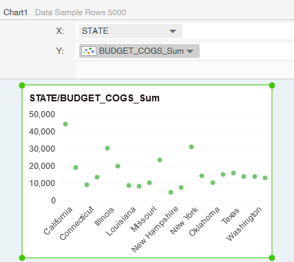
The point chart shows the relationship between the values in several data series, or draws two sets of numbers as a series of xy coordinates.
The point chart has two numerical axes, displaying a set of numerical data along the abscissa axis (x axis) and another set of numerical data along the ordinate axis (y axis).The point chart combine these values into a single data point and display them in uneven intervals or clusters. It's commonly used to display and compare numerical values such as scientific data, statistics, and engineering data.